实现垂直水平居中的6种方法
单行文本
html
<div id="wrap">
  <p>垂直水平居中的文字</p>
</div>css
#wrap {
  width: 200px;
  height: 200px;
  background: green;
  margin: 50px auto;
}
p {
  text-align: center; /* 水平居中 */
  line-height: 200px; /* 垂直居中 */
}最终效果:

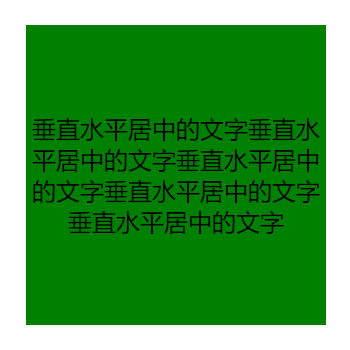
多行文本
html
<div id="wrap">
  <p>垂直水平居中的文字垂直水平居中的文字垂直水平居中的文字垂直水平居中的文字垂直水平居中的文字</p>
</div>css
#wrap {
  width: 200px;
  height: 200px;
  background: green;
  display: table; /* 使块状元素成为一个块级表格 */
  margin: 50px auto;
}
p {
  display: table-cell; /* 子元素设置成表格单元格 */
  text-align: center;	/* 水平居中 */
  vertical-align: middle;	/* 使表格内容居中显示,即可实现垂直居中的效果 */
}最终效果:
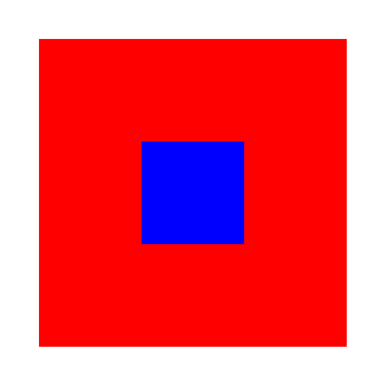
使用负的margin值
html
<div id="wrap">
  <div class="box"></div>
</div>css
#wrap {
  width: 300px;
  height: 300px;
  background: red;
  margin: 50px auto;
  position: relative;
}
.box {
  width: 100px;
  height: 100px;
  background: blue;
  position: absolute;
  left: 50%;
  top: 50%;
  margin-top: -50px; /* 向上移动自身的一半 */
  margin-left: -50px; /* 向左移动自身的一半 */
}最终效果:
绝对定位+margin: auto
html
<div id="wrap">
  <div class="box"></div>
</div>css
#wrap {
  width: 300px;
  height: 300px;
  background: red;
  margin: 50px auto;
  position: relative;
}
.box {
  width: 100px;
  height: 100px;
  background: pink;
  position: absolute;
  top: 0;
  right: 0;
  bottom: 0;
  left: 0;
  margin: auto;
}最终效果:

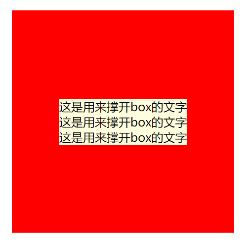
使用CSS3的 transform: translate
html
<div id="wrap">
  <div class="box">
    <p>这是用来撑开box的文字</p>
    <p>这是用来撑开box的文字</p>
    <p>这是用来撑开box的文字</p>
  </div>
</div>css
#wrap {
  width: 300px;
  height: 300px;
  background: red;
  margin: 50px auto;
  position: relative;
}
.box {
  background: greenyellow;
  position: absolute;
  top: 50%;
  left: 50%;
  transform: translate(-50%, -50%);
}最终效果:
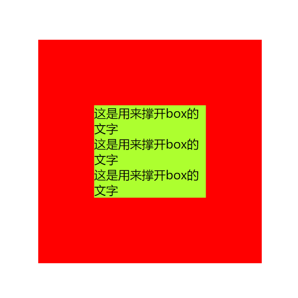
使用display: flex
html
<div id="wrap">
  <div class="box">
    <p>这是用来撑开box的文字</p>
    <p>这是用来撑开box的文字</p>
    <p>这是用来撑开box的文字</p>
  </div>
</div>css
#wrap {
  width: 300px;
  height: 300px;
  background: green;
  display: flex; /* 定义为弹性容器 */
  align-items: center; /* 在纵轴上垂直居中对齐 */
  justify-content: center; /* 在主轴上垂直居中对齐 */
  margin: 50px auto;
}
.box{
  background: lightyellow;
}最终效果: